A few weeks ago we talked about Flags vs. Star Ratings, however Lightroom offers one marking tool that we didn’t discuss – Color Labels.
Color labels are text metadata represented by a color. There’s a choice of 5 colors – red, yellow, green, blue or purple – and they can mean anything you like.

Lightroom offers its usual variety of ways to assign a color label. The shortcuts 6, 7, 8 and 9 assign the red, yellow, green and blue labels, although purple doesn’t have a shortcut. You can click on the color label on the thumbnail, if it’s showing, or in the toolbar. You’ll find them in the right-click menu under Set Color Label, or under the Photo menu. And that’s just a few of the choices! And of course, there’s always the Painter tool we discussed last week.
What do you use color labels for?
I’ve heard some interesting ideas for using color labels. These are a few of my favorites:
- what needs to be done to the photos – HDR/panorama sets, LR/PS retouching needed, finished photos
- output options – Facebook, Flickr, web galleries, email, print
- multiple cameras at the same shoot – each camera gets its own color, which helps identify them at a glance when developing
- who took the photo – particularly useful in a family environment
- workflow – to flag/star, to be keyworded, to be developed, to output
- rating photos – some people skip flags and stars, and just use color labels
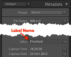
The color itself isn’t stored with the photo. If you look in the Metadata panel, you can view the label text assigned to the selected photo.
Using Metadata menu > Color Label Set > Edit, you decide which color to use to represent that text. You can even create lots of different sets, although that can get a bit confusing. If a label text doesn’t match a color in the current label set, it shows as white instead.

But how do you remember which color to use? You could repeatedly go back to the Metadata menu > Color Label Set > Edit to check. You could write them on a post-it note and stick it to the side of your computer. Or you could borrow my trick, and add them as a panel end mark in Lightroom.


Thank you for the article
Mine is as follows
0 * = Unprocessed
1 * = Stock Photography + @stockphotography keyword
2 * = Select for processing within a photo shoot for clients
3 * =
4 * =
5 * = Stunning Images
Also Color label
Green = Edit for Stock
Red = Stunning photo for retouch
I addition I used other techniques using a combination of Collection and Special keywords to categorize my photos.
My best tip that works very very good with me is a smart collection for rejected images. Every 2 or 3 days I check my rejected images for a final review and delete them permanently. If you see your image with a clearer mind you may find out that with a little retouching it can survive.
Thank you
Thanks for sharing that. Especially good tip on the smart collection for rejected!
Could some kind person help me with the “Or you could borrow my trick, and add them as a panel end mark in Lightroom.” I cant work out how to do that. Thanks
This is set in Preferences > Interface – if you create a .png with the text details you want to remember, you can point to it here and it will always appear in the bottom right panel (under the Comments panel)
I use it to remind me what the colors mean, which I allocate to specific cameras. It’s just a reminder!
It’s been almost a year since this thread was last used, but I just found it and thank you heartily for it! I’ve been delving in deep to better mastering my sorting and rating scheme for my 21000-image library, and reading through this article and the comments after were exactly what I needed to finish coming up with a scheme that works for me.
I realize these schemes can be quite subjective, depending on the photographer and their use needs, but in case it’s helpful, here’s the scheme I devised for me. For reference, I would call myself a semi-professional fine art photographer and amateur digital artist, who shoots mostly for the love of it but has sold work before, does the occasional gig-for-hire, and posts to social media and a few print-on-demand services.
Numbers:
0 – Unprocessed
1 – Snapshot, or otherwise tells a story
2 – Valuable. Gig work, textures for use in digital art, documentation of any kind
3 – Album-worthy. If I post a batch of pics, from a trip, event, or experience, the image works well in that context.
4 – Print-worthy. I either have printed this, or think it would look great in print. Also a barometer for Instagram.
5 – Portfolio. My best work.
Colors:
Purple – Of the 4 and 5 star photographic images, the “final” chosen edit/crop for that shot.
Blue – Alternate processing/cropping/enlarging/reducing of 4 and 5 star images. I have a lot of Virtual Copies here with different aspect ratio crops or processing.
Red – Of the 4 and 5 star digital art, the “final” version of the piece.
Green – Alternate versions of those 4 and 5 star digital art pieces.
Yellow – Templates or other reference images needed to prepare my work for various websites.
I’m glad we could help maggyver. Thanks for sharing your conclusion.
I have cusomized the LabelColors into names i.e. Red=Name a; Yellow= Name b and so on. In all filters the cusomized names show up exept in the Creteria Flieds of the Smart Collections where the Color Labels have still showing there original Color Names like Red; Yellow and so on. What must I do in order to see also in Smart Collections the customized names?
Thank you in advance
The smart collection list doesn’t automatically update its list, but in the pop-up, select Label Text and type the customized name instead of selecting Label Color.
Now I understand the use of Label Text in that particular section. Once I had typed in f.e. Name b and saved it the criterion did what I expected it to do.
Thank you again for your time.
Regards
Cor
Hi, thanks for this, Victoria. Is it possible to set up your own shortcut for the purple key? I have not yet found the answer via google! (I am pc not mac)
Many thanks,
Angela.
No. Well… that’s to say, not built in. There are some workarounds depending on your operating system: https://www.lightroomqueen.com/custom-keyboard-shortcuts/
Can one filter collections by color labels in Lightroom Mobile?
No, color labels don’t sync to mobile, sorry.
I also include the number for each color on a post-it note by the computer. I don’t use the colors that much though. I like to make several passes on my pictures. First pass, either a 1 or an X; then discard all the x pictures. Then I review the 1-rating and eliminate nearly duplicate pictures (and keep the best one). From there, I give my favorites a 2 rating; review the 2’s and pick my favorites and assign 3 stars. I rarely go above 3 unless it is REALLY outstanding. Lastly, I look at all the 2’s or better, and flag the ones I want to go in a book (for scrapbooking). These are the ones I print after I’ve “developed them”. All 3-stars or better go into a smart collection that I created for each year. These go on Lightroom mobile.
I would love to know how to get my colors list in the end cap
I love the tip to put color choices in the end cap. However, I am unable to add my list to the panel end cap. When I click on “go to panel end caps folder, I get that; but, when I try to follow the same path to put a document in that folder, it seems to be nonexistent! What am I missing?
They’re probably hidden files Christina. Try How do I show hidden files to find my preferences and presets? on this page.
I followed the link and found the hidden Library folder; so I moved it to the side panel. The WORD document I had created wouldn’t work and when I closed and re-opened LR, I got this error, “an error occurred when attempting to change modules” (even though that’s not what I was doing). So, I found a video that explained how to customize the end cap. Basically, you have to create it in Photoshop with the same background color that is in LR. I did that and saved it to the End Panel Folder; which now was easy because the hidden Library folder is now in the side panel!
Thank you for this great tip!!
Yep, they have to be PNG, TIF, PSD or GIF.
I can’t see the color of the label around the photo in lightroom, is there a setting i can change so i can see my label colors in loupe/grid view?
Yes, have a look in View menu > View Options.
I don’t have an option for color labels.
It’s in View menu > View Options > Grid view tab > Options section > Tint grid cells with label colors and there’s a percentage pop-up to its right.
Oh! Got it! I had to be in grid view in the library to see it.
G’day Victoria, I’m currently fiddling a few ideas for stars/colours and I have made smart collections for each. When naming the smart collection I have added 1 to 9 in front of each star/colour name. Naturally that number relates to the short cut key and it keeps them in order. In the smart collection name is also a description for that star rating/colour so I don’t need to remember what is doing what
9 Blue Posted (on forums)
5 ***** best/favourite photo
4**** editing done
3*** more editing (needed)
2** to edit
1* could be used instead of the Flag (??)
I’m still worrying about how best to use colours/stars; however I don’t use them for photo quality as I prefer flags for yes/no/maybe. The is it a 1* or 2* question would drive me crazy. If there are four or six photos that are all similar and OK then I just flag one with the `/~ key; keep another maybe and x the rest .
BTW I’m a just happy snapper.
Thanks for all your help
I wouldn’t worry too much about colors at this stage. You’ll find a need for them someday.
Thank you for this great article and the brilliant panel end mark tip! Inspired by your article, I began using the color labels for the different states in the workflow. However, I added the corresponding keyboard shortcut to the label description in the panel end mark, i.e. “Green – Set tags (8)” (as I can’t remember those and wrong set color labels are disastrous ; )).
I furthermore replaced the color names by swatches to make the whole thing a bit more eye-pleasing (see the PNG- and PSD-file from the following link; feel free to use this template if it is of use for you).
Cheers
sr
Thanks SR! I had to remove the link as I couldn’t access it to check the content – it said “This item might not exist or is no longer available”
Hi Victoria
I now see the same error; I have sent you an email with my panel end mark template.
Have a nice day
SR
VB – Thanks SR, here’s the link to the file:
I find it easier to select my keepers & rejects using colour labels, rather than flags. I have assigned Green to my 8 key and hover my finger, tapping it every time I want to add an image to keep. If I change my mind, I simply tap 8 again without having to move my finger or take my eyes off the screen to find another key, as I would with flags.
I can see how the green labels would be easier to spot than flags. Interesting!
The panel end mark suggestion is brilliant Victoria – thanks!
You’re welcome Gil!
Seems like I use only green label now for processed photos.
Interesting, thanks for sharing Artem.
That Panel-end mark trick is brilliant. I may add that to my classes – with credit due, of course!
You’re welcome Rikk! It’s certainly saved me some hassle!